The Associated Press
Explore navigation & featured promotions
How do you turn navigation into a multi-million dollar growth lever?
AP Newsroom provides licensed access to breaking news, images, video, audio, and graphics to media organizations globally. Primary users are editorial teams–journalists, producers, and editors–sourcing multimedia assets to support their reporting.
I owned the design of the "Explore" global navigation and featured promotions. These two features are closely connected: better navigation increases engagement, and a well-placed promotional column turns that attention into revenue for AP.
Team
Global Product Director, Metadata Director, Visual & Audio Product Owner, team of developers
The Opportunity
If users could discover AP Newsroom products outside of their current subscription, The Associated Press could generate upsell revenue from their existing customer base.
Keyword analysis of customer feedback showed a consistent pattern: the site was not designed for browsing. Users defaulted to search, not by preference, but because the navigation gave them no reliable way to explore.
I started by asking what jobs users were trying to accomplish rather than jumping to solutions. After benchmarking similar platforms, I explored three directions.
%20Proposed%20Nav%20for%20Homepage%20(Light%20Mode)%204.jpg)
Exploration #1: Horizontal nav bar across all pages
When we started designing the new search results page, the horizontal nav competed directly with search filters for space at the top of the screen. Users apply many filters on results pages, and having those two elements share the top of the screen wasn't viable.
Exploration #2: Left hamburger nav, hybrid with a horizontal nav on the homepage
Stakeholders were firmly opposed to a hamburger menu on desktop. I reframed the conversation around user intent and real estate constraints. This led to a better third direction and sparked a broader cross-functional discussion about what the nav actually needed to do.

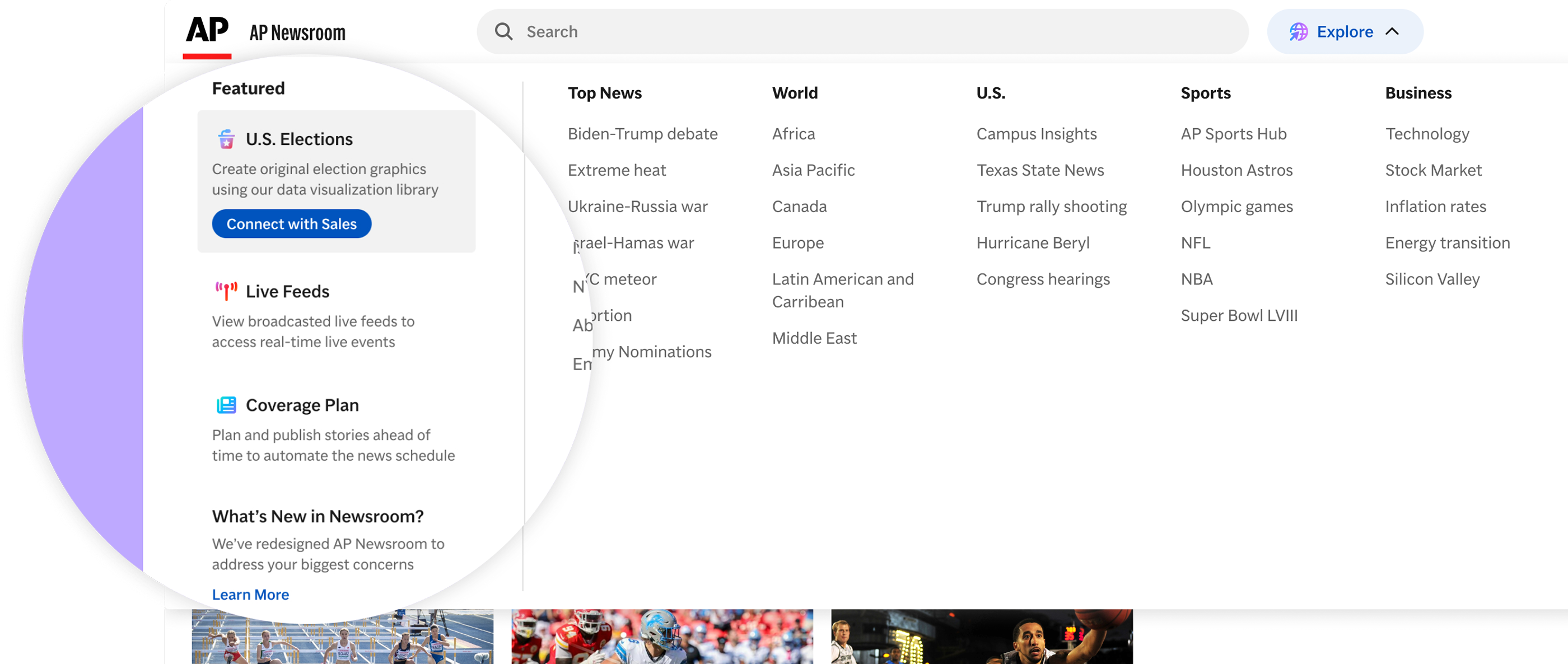
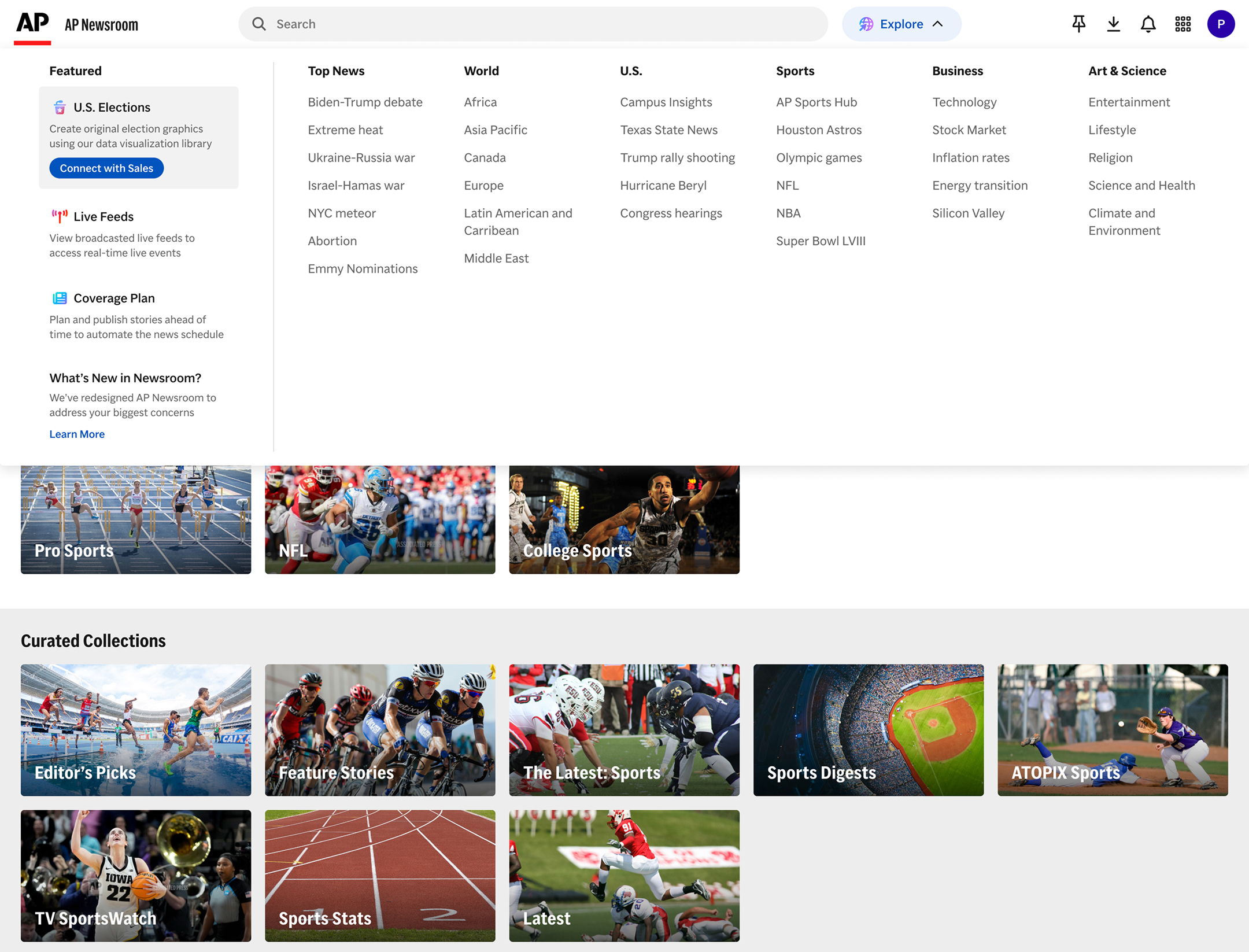
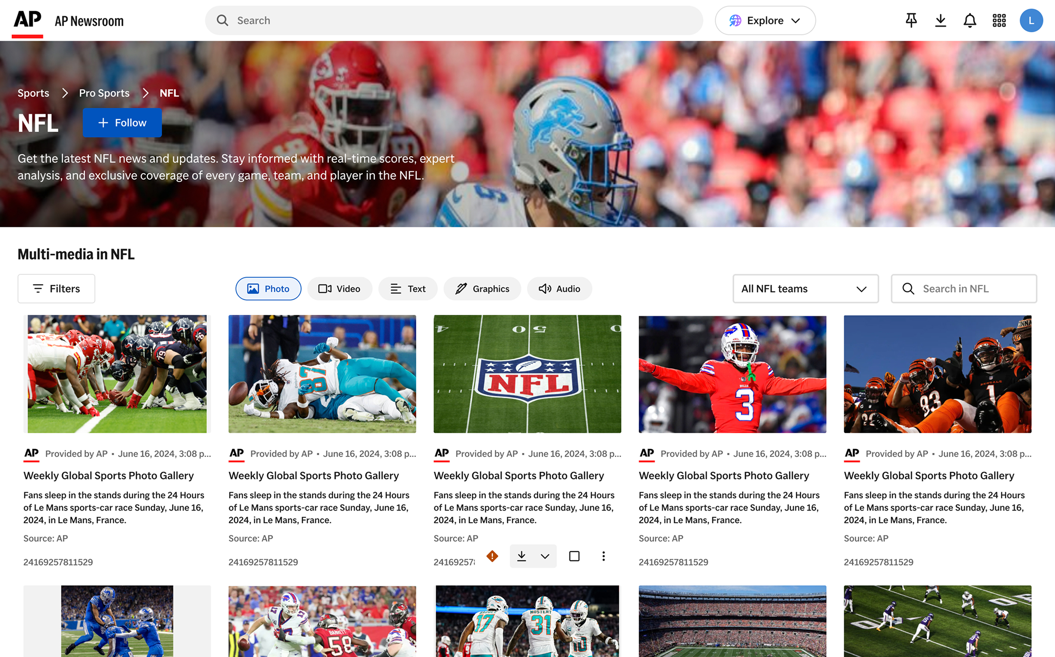
Final Direction: "Explore" button, which expands into a mega-menu
Editorial teams first check the homepage, then either search for something specific or browse a topic of interest.
Placing a single "Explore" button next to the search bar makes browsing a first-class action without competing for any existing layout real estate. Clicking it opens a mega-menu with 6 stable top-level categories.
The mega-menu's “Featured” section was an opportunity to increase revenue with existing customers. I worked with the Head of Sales to rank the top 15 revenue-generating products, then used Salesforce data to map the customer type: TV, Radio, Newspaper, or Digital. Each slot shows the highest-ranked product the user doesn't already subscribe to. Visual hierarchy was also given to promote conversion.
Products can also be force-ranked for a set time window. For example, U.S. Elections was prioritized as the top promotional item leading up to November 2024.


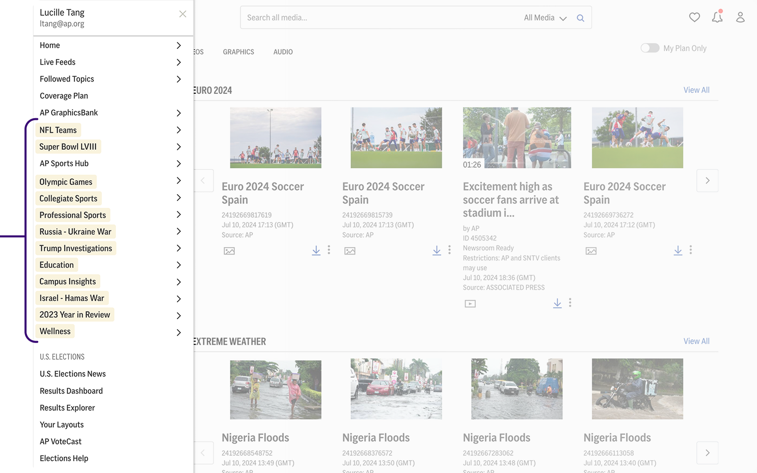
Every item in the Explore mega-menu links to a topic page. With new topics added weekly — sometimes daily — we couldn't afford to custom-design each one. The system needed to be fast to launch, content-discoverable, and followable across a wide range of coverage areas.
I created a 3-level system by mapping how users navigate across levels of specificity:
The redesign shipped in Q1 2025. The results validated the UX and business case within the first month:
.jpg)